We have been posting some of the UI demo animations on twitter and thought it would be great to put them all in a new post with some information on the design decisions we made when redesigning the new Overture user interface.
Sliding sidebar
We love this feature, having the ability to fold that sidebar away when you need more space such as in the calendar or in a large report is super useful. We hope you like it as much as we do.
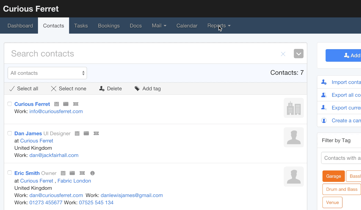
Color picker
One of the usability problems caused by the old full spectrum color picker is a lot of the bookings and events on the calendar lacked contrast so we provided a bunch of lovely colors for you to choose from, helping to make your calendars look great. If you have set up your colors already they will stay the same as you are used to.
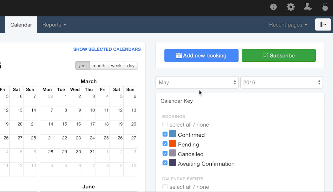
Dropdown menus
We decided that the sidebar menu was inconsistent in reports, it prevented the more important options from being in the top of the interface so we added a dropdown menu to the main navigation so you can select the report you need without having to go to the reports section first. We liked this addition so much we also added it to the recent pages and the Mail menu items.