The brief
Streaming services can’t get Classical right. They were designed to suit pop music. Classical requires a different data structure that doesn’t fit into the Artist, Albums and Songs model. To improve the User Experience of Classical music listening we propose some design changes to be incorporated into a new product.
- Improve the use of Classical metadata and formatting within the User Interface to include better representation for conductors, soloists and composers etc.
- Move beyond one track one movement (song) model, to include movements as part of the search structure.
- Allow better discovery through search where accuracy is just as important as popularity.
- Tailor experiences so that novices and experts alike feel they can discover something new.
- Improve sound quality with a download to device option at a higher quality similar to BBC iPlayer app.
Disclaimer: This is a pure design exercise, we don’t have any current plans to build this app but if you like it, or have any thoughts, please let us know, we would love to hear from you.
With that in mind, we present …
Overture Avanti
Avanti or to move forward fits well with the Overture brand, linking with our “For everything before the performance” tagline, in the same way that the Overture app enables agencies to work better the Avanti app will enable the full enjoyment of Classical music for a variety of listeners.

We loved the idea of overlapping circles to represent the many layers of Classical currently missing from streaming services.
The UI
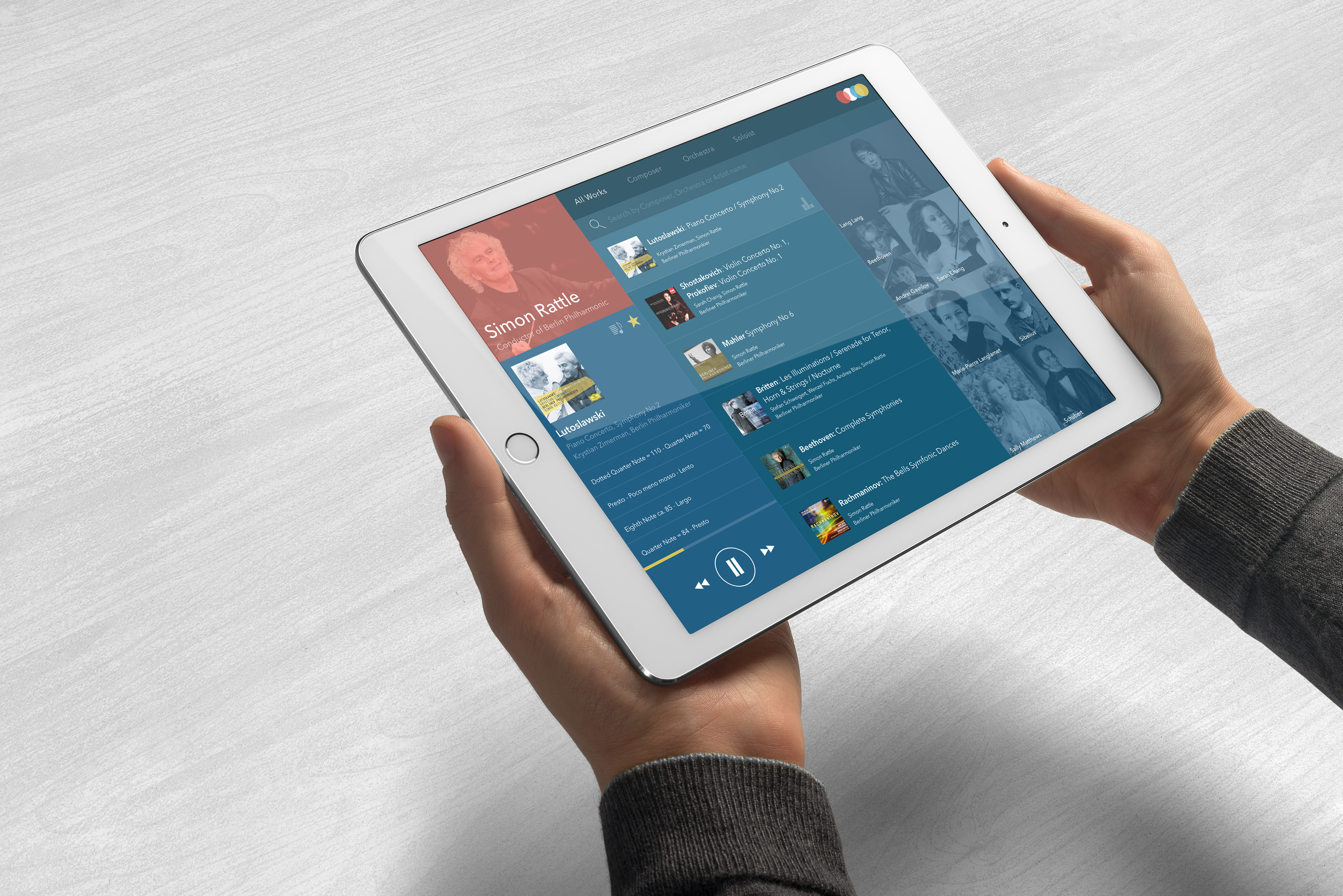
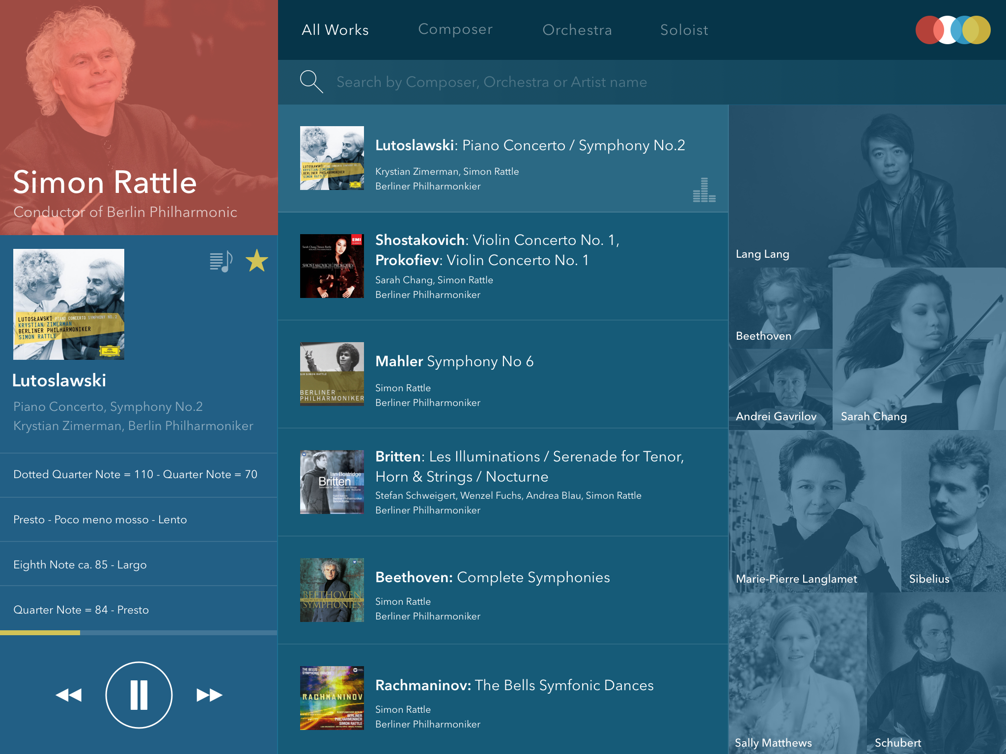
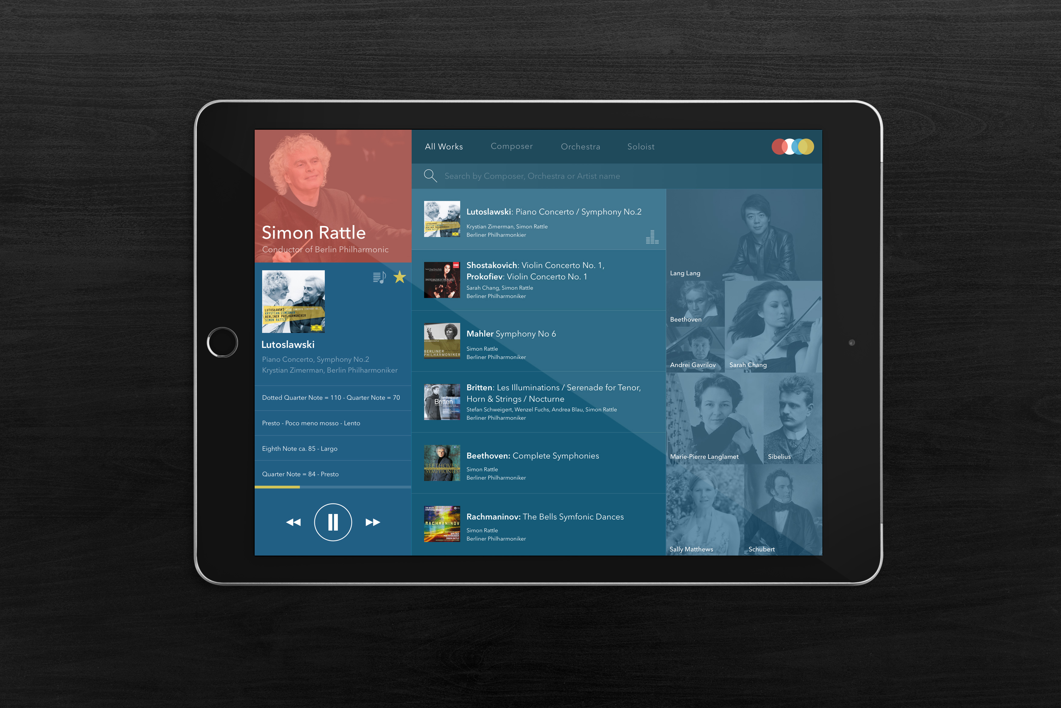
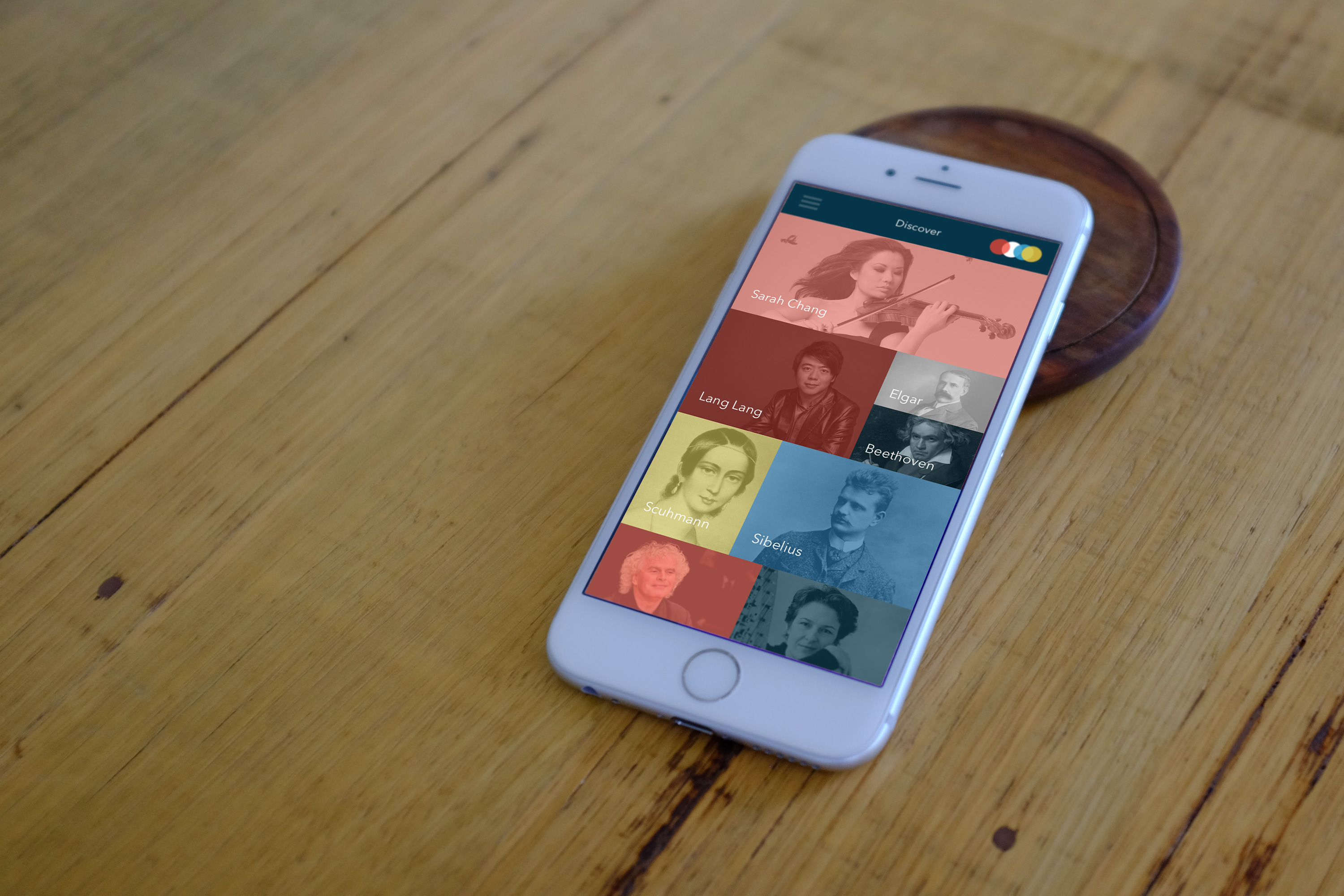
We wanted to show how a listener would navigate around works associated with their chosen composer, conductor, orchestra or soloist. After an initial discovery screen similar to the one displayed on the iPhone shot below a listener would be presented with all works by their chosen result where they could easily favourite or add to a playlist, an entire work or just a single movement.
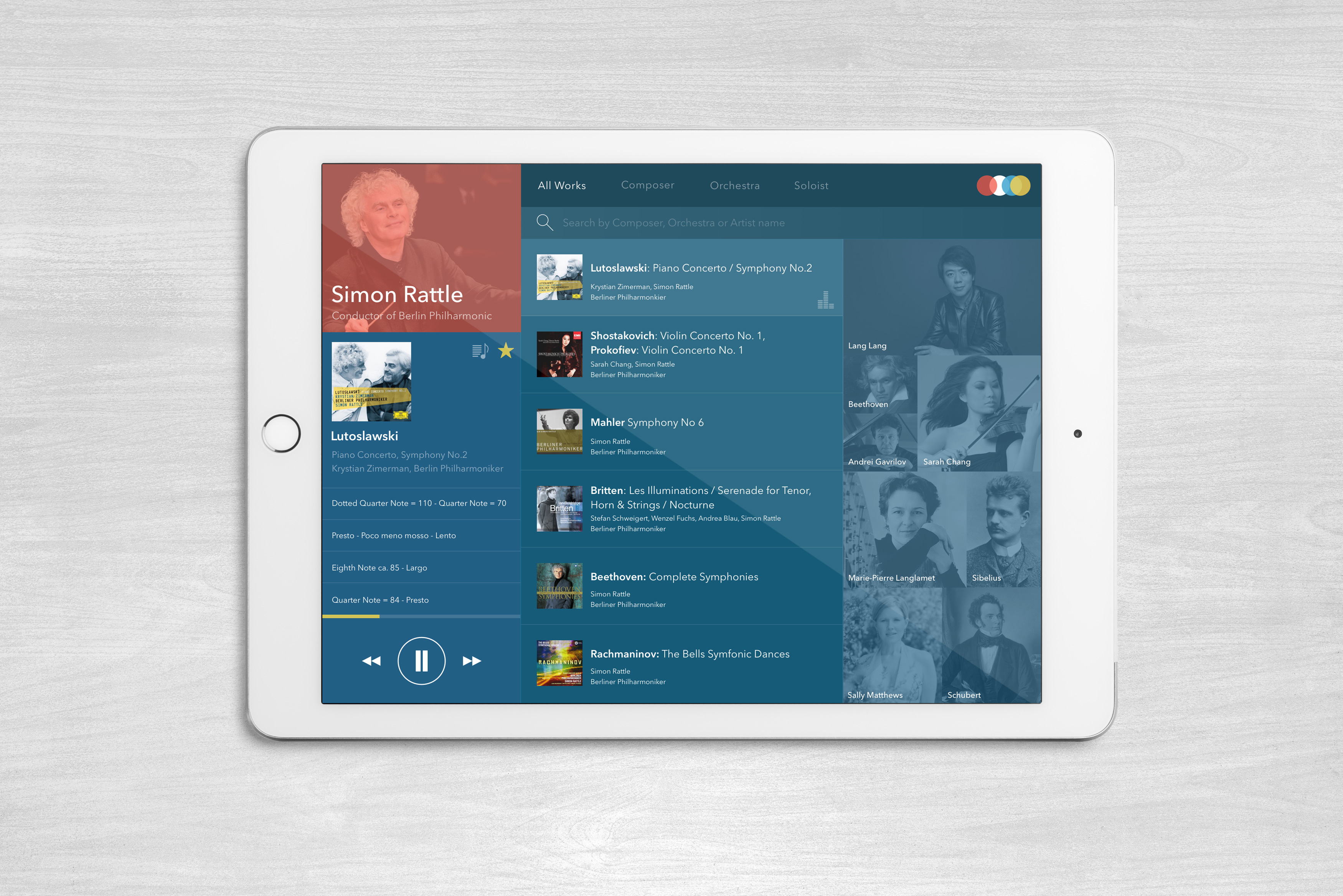
The UI encourages discovery by showing large images that when tapped would filter the main results. In the case of the iPad screenshot if a listener tapped Sibelius then all works of Sibelius conducted by Simon Rattle would be presented for selection.
Each listing is complete with all soloists, composer, conductor and orchestra solving the current problem in streaming of lack of detailed information about each work. There is also a comprehensive search option allowing listeners to further refine their results by works not currently listed on the screen.
More ideas
Although not show in the screenshots we wanted to give a brief list of some of the other ideas that we believe would make discovery and listening more fun and enjoyable.
- Level – In the setup process we would ask the listener to describe their experience. Perhaps just, beginner, intermediate or expert. Using that data Avanti would be able to suggest works for the listener to enjoy.
- Curation – Particularly with Classical we think suggestions and playlists would benefit from curation by folks who really know their stuff.
- FLAC? – As mentioned in the brief 192kbs really doesn’t cut it when listening to classical but we understand the online sometimes this is the best option so implementing a download to player option, similar to the BBC iPlayer app could be a solution.
Thanks for taking a look. If you have any ideas, feedback or thoughts then please feel free to add them below or get in touch on twitter @overturehq

